TYPOGRAPHY
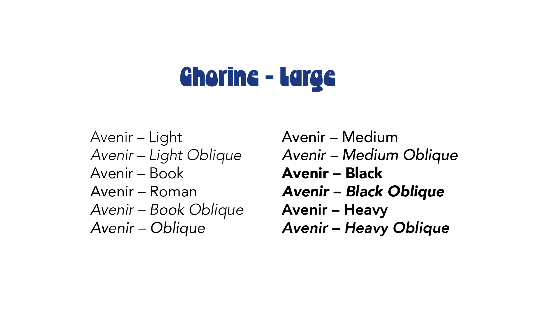
The typography for Wine N' Weenies walks the fine line between chaotic personality and actual readability—because as fun as this brand is, people still need to read the menu. For display moments, I chose Chorine, a bold, funky typeface that brings instant attitude. Its quirky shapes and strong presence capture the playful, slightly feral energy of the brand, making it perfect for headlines, titles, and anywhere the brand needs to loudly announce itself. For
body copy, I used the Avenir type family in a variety of weights. Avenir’s clean, rounded forms balance out the chaos, keeping everything approachable, friendly, and easy to read. Think of it as the responsible friend making sure things don’t get out of hand. Together, Chlorine and Avenir create a type system that feels bold, approachable, and full of personality—perfectly matching the fun, slightly rebellious vibe of Wine N' Weenies.
body copy, I used the Avenir type family in a variety of weights. Avenir’s clean, rounded forms balance out the chaos, keeping everything approachable, friendly, and easy to read. Think of it as the responsible friend making sure things don’t get out of hand. Together, Chlorine and Avenir create a type system that feels bold, approachable, and full of personality—perfectly matching the fun, slightly rebellious vibe of Wine N' Weenies.
Color Palette
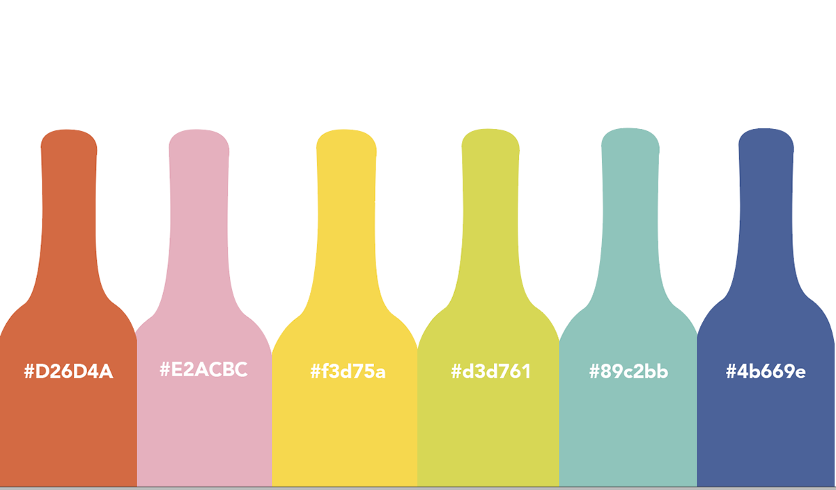
The Wine N' Weenies color palette was built to match the brand’s personality: loud, fun, and absolutely not trying
to impress a bunch of wine snobs. Soft yellows and warm pinks bring the friendly, welcoming energy—because this vineyard is more about good vibes than fancy rules. Rich reds nod to the wine itself while adding bold pops of color that keep everything feeling lively and a little chaotic. Cool blues step in to balance things out before the palette completely spirals, giving the design some contrast and breathing room. Together, these colors create a bright, punchy visual system that feels youthful, and just rebellious enough to remind you this isn’t your typical vineyard.
to impress a bunch of wine snobs. Soft yellows and warm pinks bring the friendly, welcoming energy—because this vineyard is more about good vibes than fancy rules. Rich reds nod to the wine itself while adding bold pops of color that keep everything feeling lively and a little chaotic. Cool blues step in to balance things out before the palette completely spirals, giving the design some contrast and breathing room. Together, these colors create a bright, punchy visual system that feels youthful, and just rebellious enough to remind you this isn’t your typical vineyard.
Logo Exploration
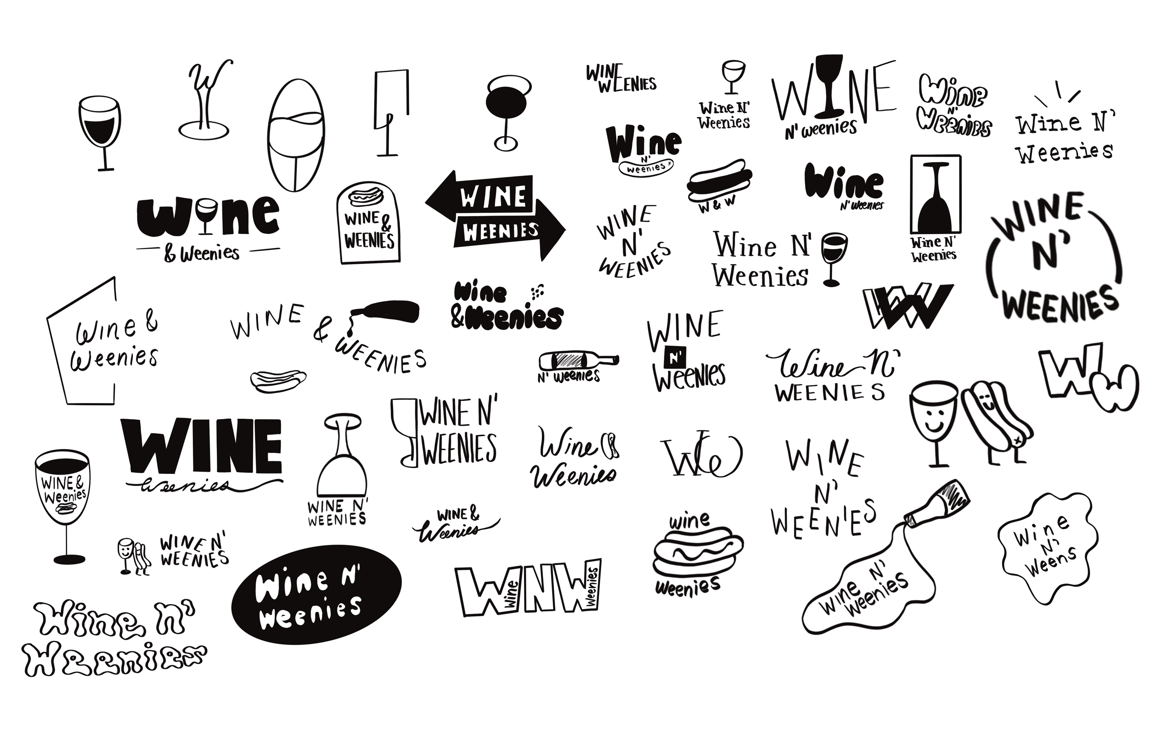
To develop the final Wine N' Weenies logo, I went a little design gremlin and sketched over 50 different concepts. Throughout the process, I experimented with playful typography, weird icon combos, and every possible way to visually connect wine with comfort food—because yes,
making hot dogs and wine look like they belong together takes some work. Each round of sketches helped me figure out what actually felt right for the brand: fun, approachable, and just a little bit chaotic. Some ideas were great, some were questionable, and some deserved to be quietly forgotten. After sorting through the chaos and refining the strongest directions, I landed on a final logo that balances personality with clarity and captures the playful spirit of Wine N' Weenies.
making hot dogs and wine look like they belong together takes some work. Each round of sketches helped me figure out what actually felt right for the brand: fun, approachable, and just a little bit chaotic. Some ideas were great, some were questionable, and some deserved to be quietly forgotten. After sorting through the chaos and refining the strongest directions, I landed on a final logo that balances personality with clarity and captures the playful spirit of Wine N' Weenies.
Logo
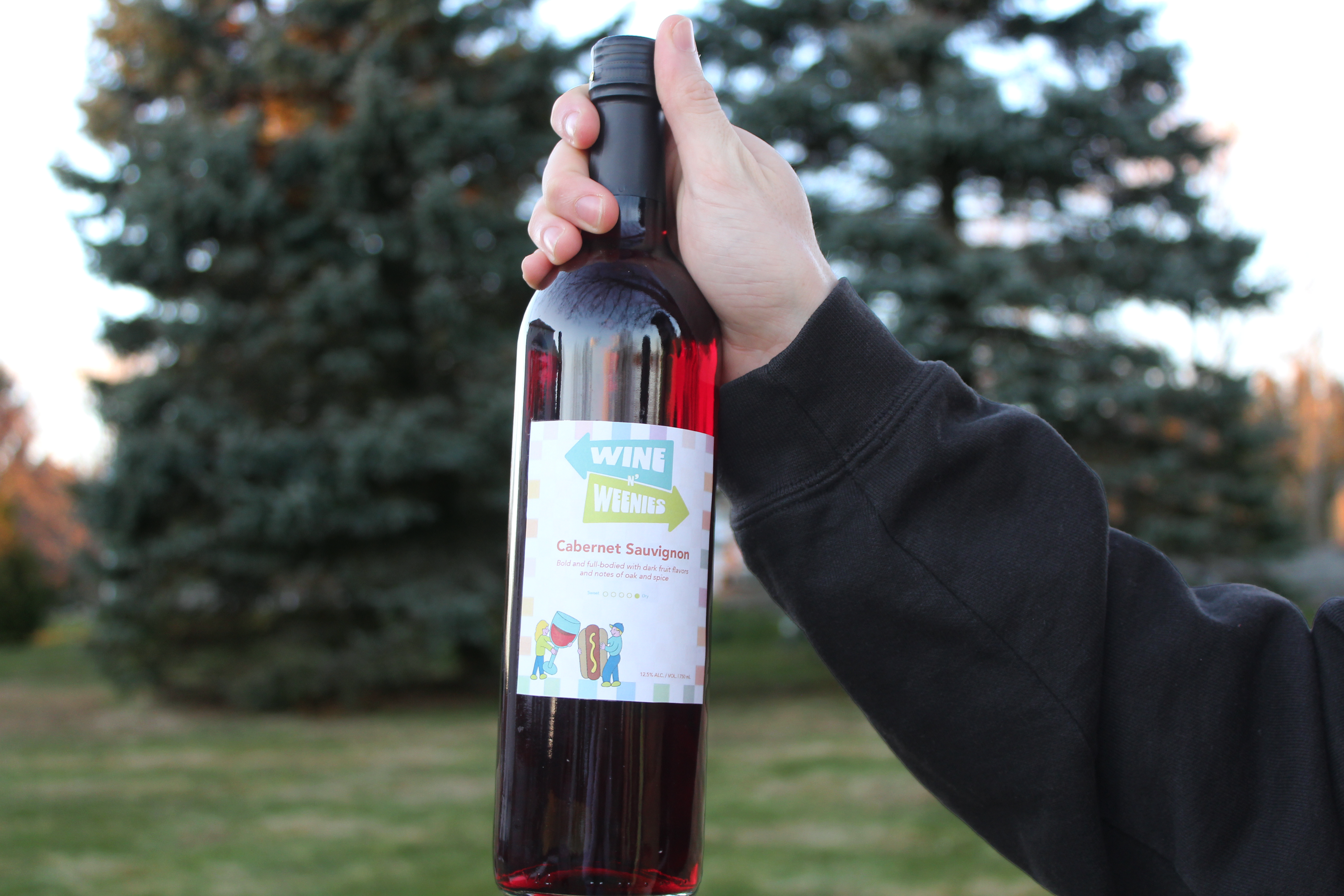
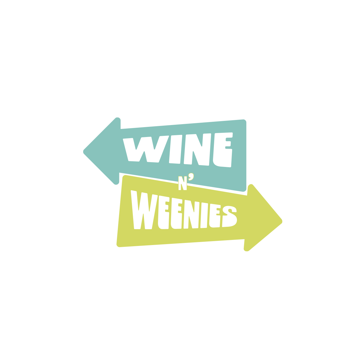
The Wine N' Weenies logo sets the tone for the entire brand right away—bold, playful, and full of personality. The design features two opposing arrow shapes, creating a dynamic push-and-pull effect that reflects the unexpected pairing of wine and hot dogs. It feels energetic, slightly rebellious, and impossible to ignore (which is exactly the point). The chunky, rounded typography adds to the approachable, fun-loving feel of the brand, making it welcoming rather than intimidating. The bright, contrasting colors help each element stand out while still working together as a cohesive system, reinforcing the brand’s lively and youthful vibe. Altogether, the logo acts as a visual introduction to Wine N' Weenies—a brand that breaks tradition, keeps things fun, and always points you in the direction of a good time.
Imagery Exploration
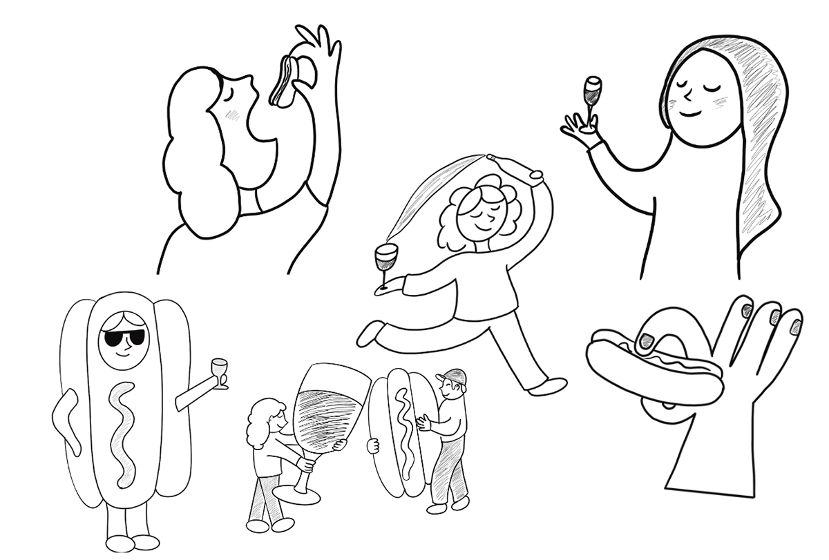
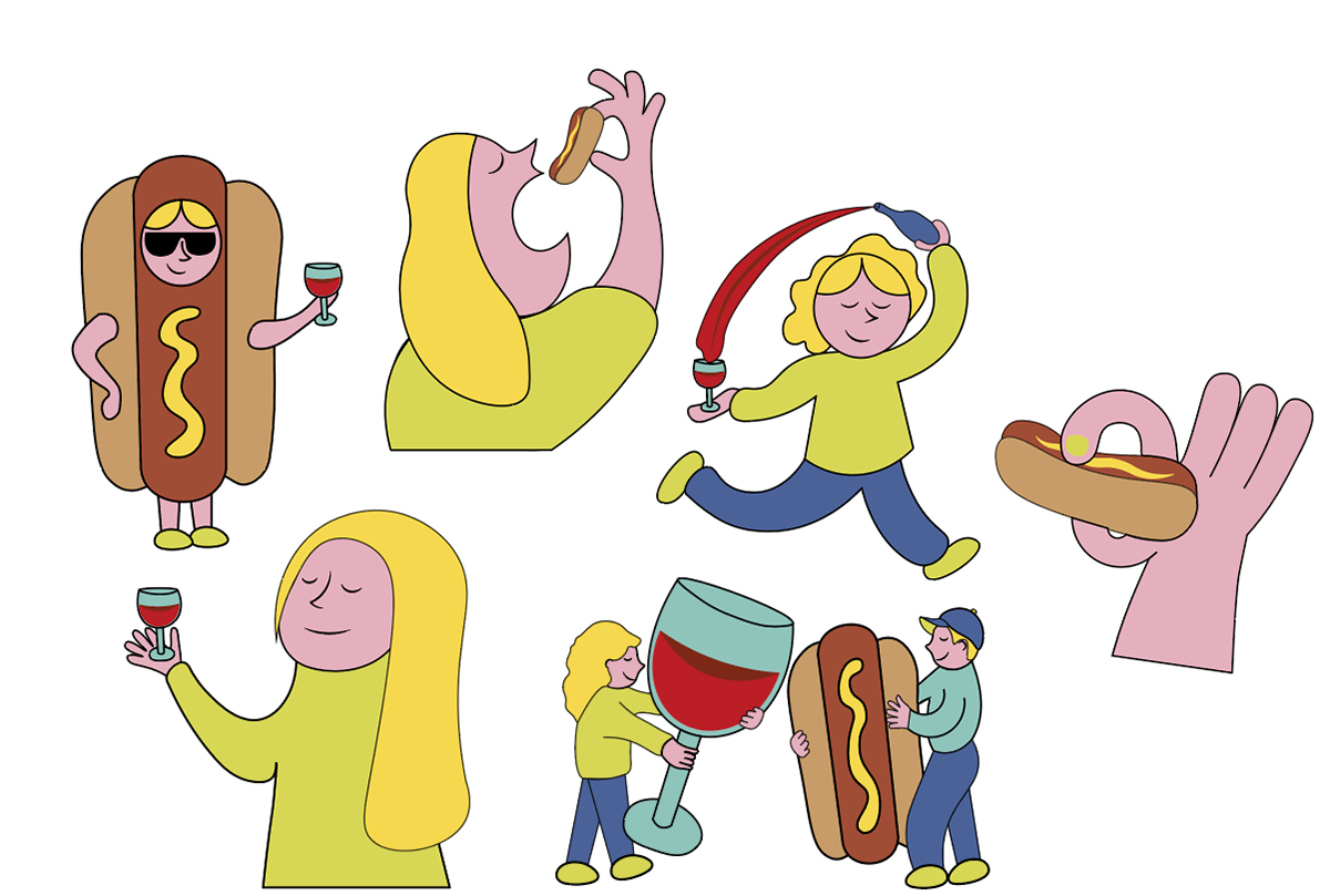
To build the visual world of Wine N' Weenies, I started by sketching a bunch of playful, character-driven illustrations. I experimented with exaggerated poses, ridiculous interactions between wine and hot dogs, and simple shapes that feel friendly, goofy, and impossible to take too seriously. Because if this brand is pairing wine with weenies, the visuals needed to match that level of unhinged energy. These early sketches helped establish the tone of the brand: fun, quirky, and a little chaotic in the best way. From there, I refined the drawings into the final illustration style used throughout the project—bold outlines, soft rounded shapes, and characters that look like they’re having way more fun than the average vineyard mascot. The result is a visual style that perfectly aligns with the carefree, slightly chaotic spirit of Wine N' Weenies.
Imagery
Throughout the illustration process, I went full chaos mode, testing all kinds of expressions, props, and ridiculous interactions to find the perfect balance between whimsical and readable. I wanted the characters to feel alive, approachable, and just a little unhinged—because this is Wine & Weenies, not your typical stuffy vineyard. The final imagery leans heavily on the brand’s color palette—soft yellows, warm pinks, rich reds, and cool blues—to create a cohesive visual language that feels vibrant, friendly, and totally chaotic in the best way. Every hue was chosen to support the personality of the brand, make the characters pop, and keep the energy playful across all applications. Together, the colors and illustrations tie everything back to Wine N' Weenies, making the characters instantly recognizable, impossible to ignore, and perfectly on-brand like a vineyard that knows how to have fun, break a few rules, and encourage a little chaos while you sip.
Photography
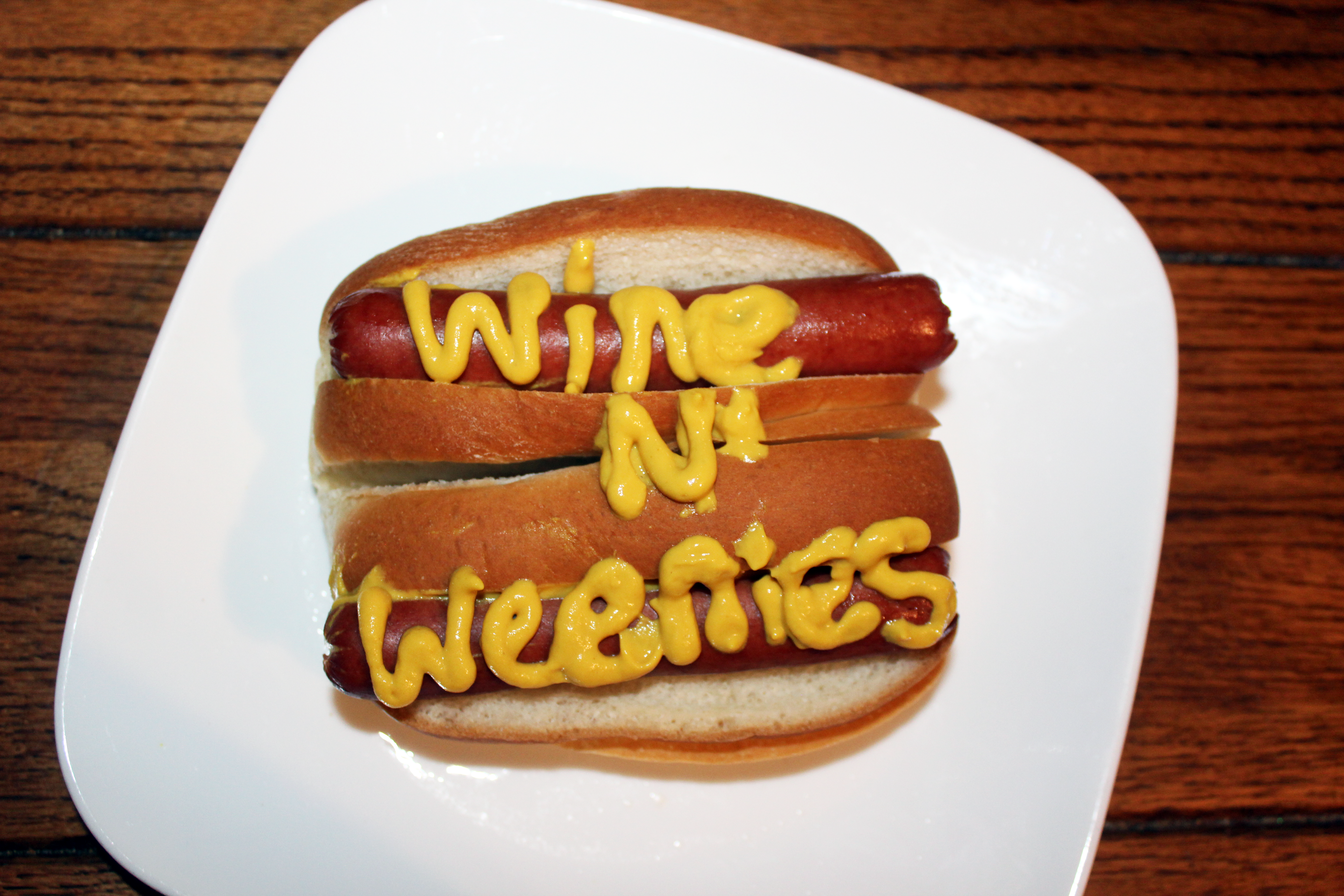
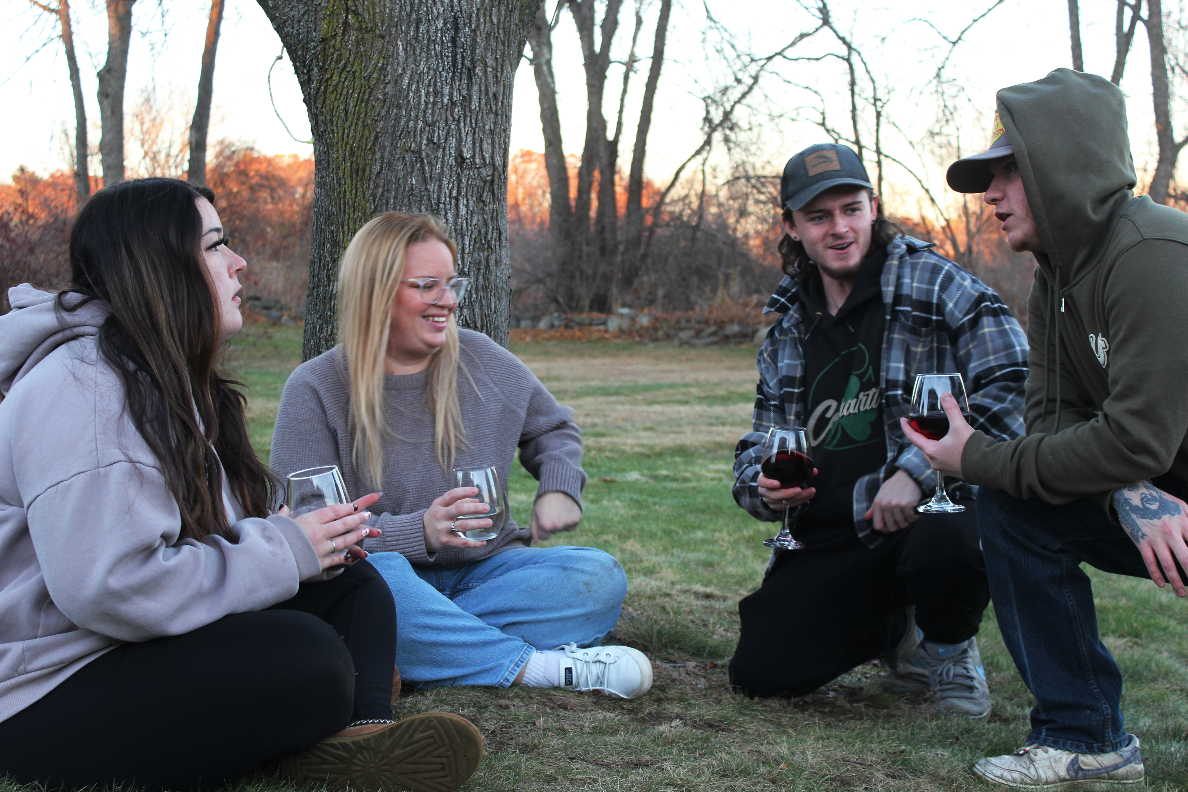
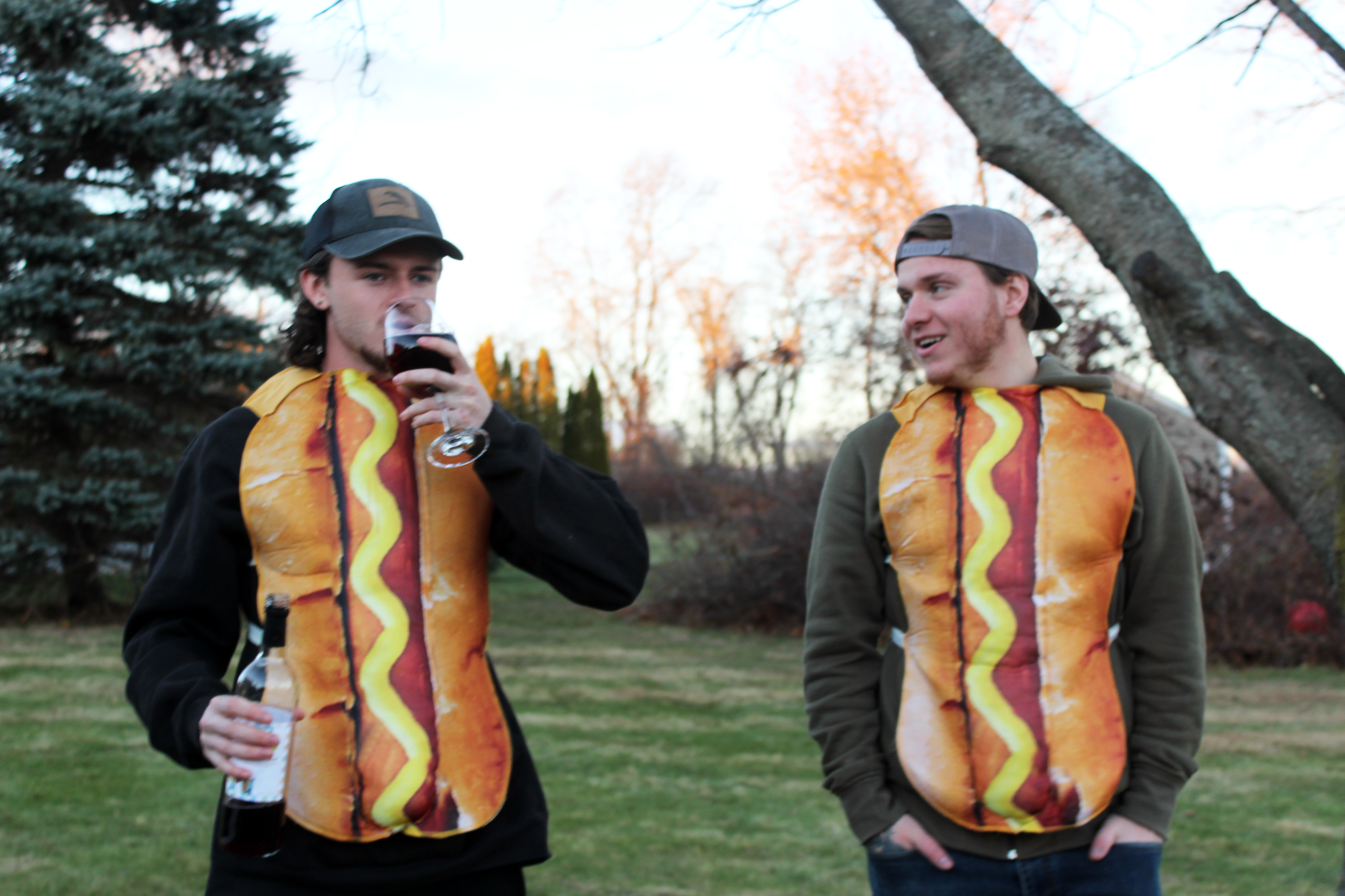
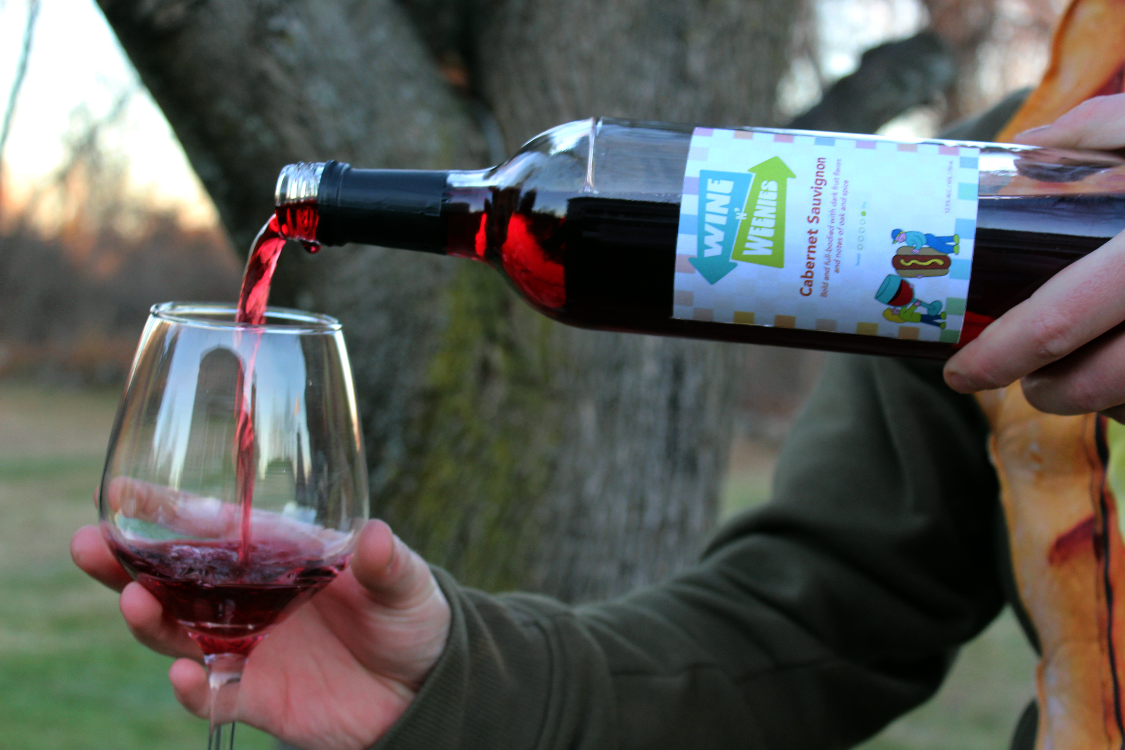
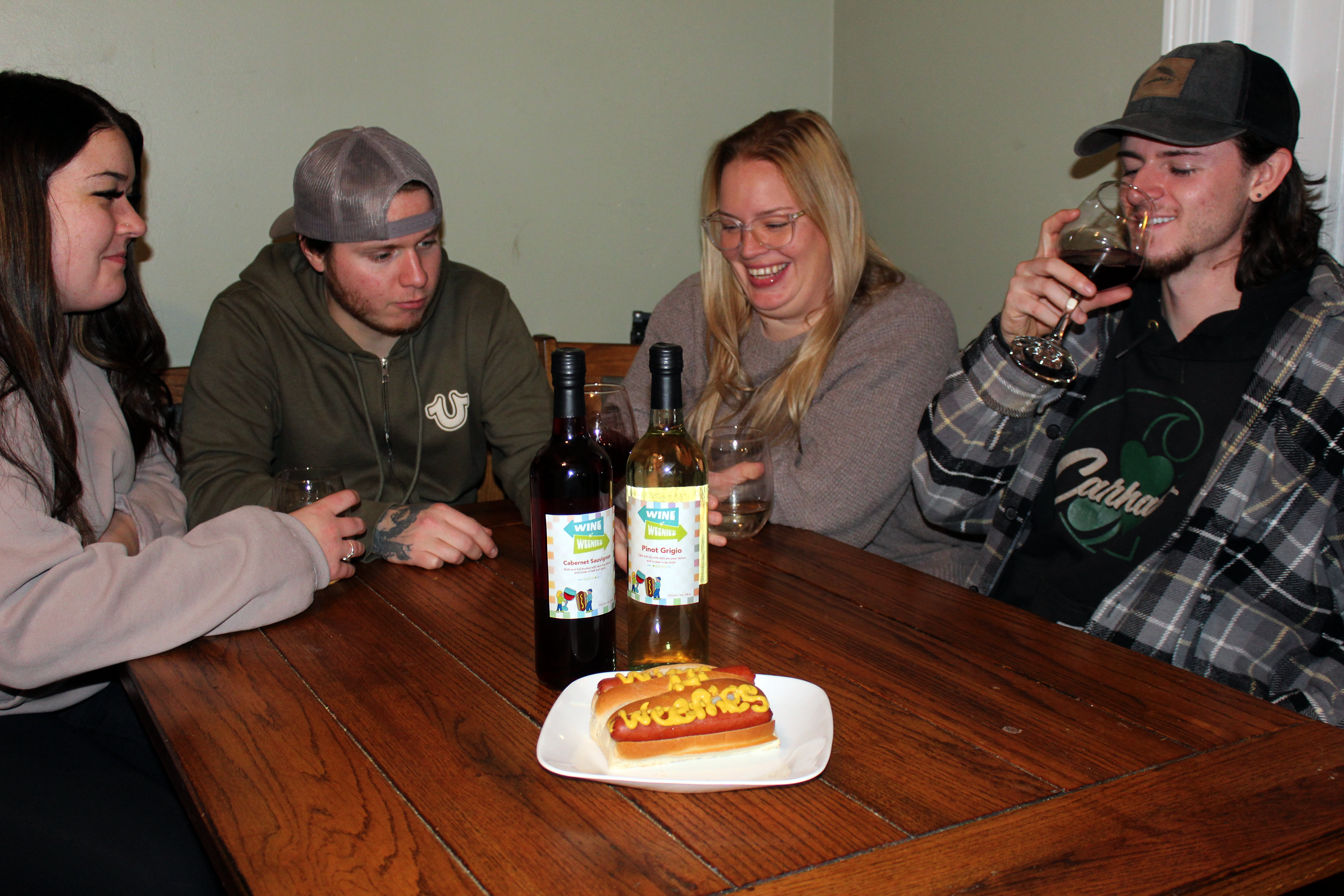
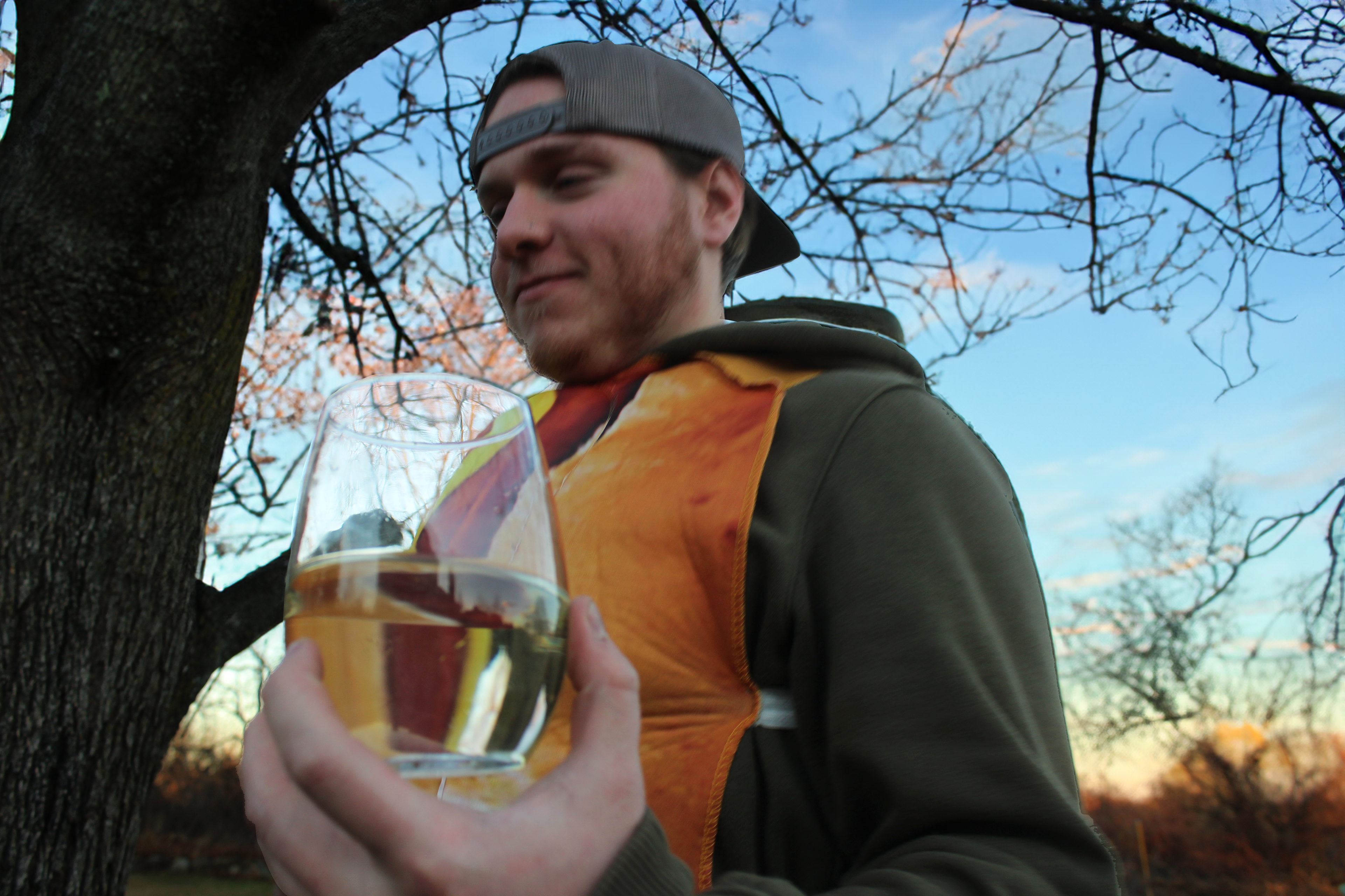
The photography for Wine N' Weenies captures the brand’s playful, social, and slightly chaotic personality. Instead of stiff, overly staged vineyard photos, the focus is on real interactions—friends laughing, sharing wine, and fully committing to the ridiculousness of the hot dog theme. The goal was to show that this brand doesn’t take itself too seriously, and honestly, neither should the people enjoying it. The photos are intentionally candid and energetic rather than perfectly posed, which helps the brand feel authentic and approachable. Natural outdoor lighting and relaxed vineyard settings keep everything warm and inviting, while the hot dog costumes bring the extra personality (and a little bit of chaos). Because if you’re going to pair wine with weenies, you might as well lean all the way in. Together, these images reinforce the lively, fun-loving identity of Wine N' Weenies, showing that this vineyard is less about quiet swirling and sniffing—and more about laughing with friends, embracing the weird, and having a good time.